
Redesigning a health data platform to help insurance brokers find the health plans faster
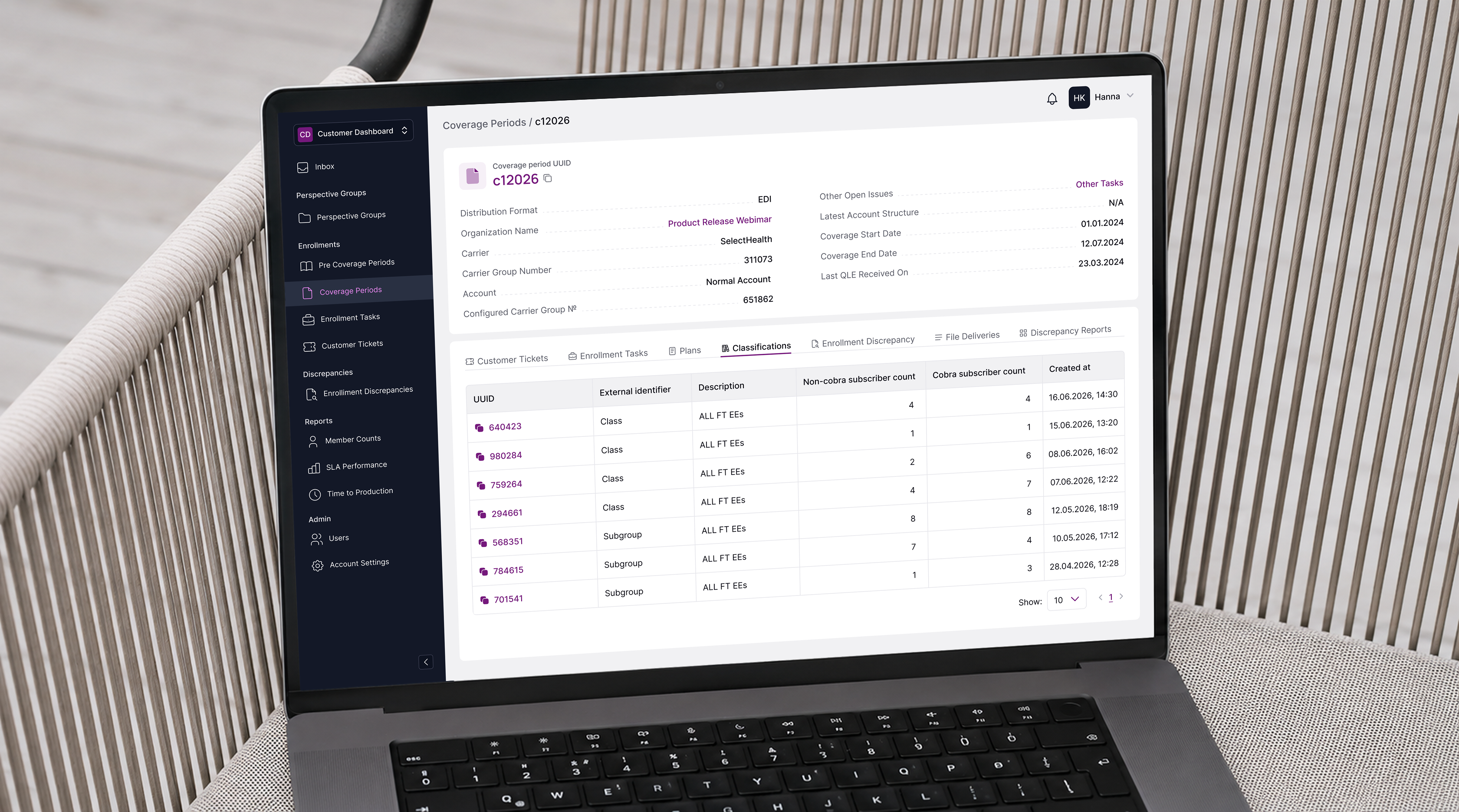
Our client provides API-powered data connectivity for the health and benefits industry — helping insurance carriers and benefits platforms share real-time plan data from quote to renewal. This was our third engagement with them, and their most complex challenge yet: design a brand new data availability dashboard for external users.
Insurance brokers and benefits platforms using the client's API need to know exactly which health plans are available, in which states, from which carriers and when. The existing data availability tool had the data, but the experience made it nearly impossible to explore independently.
Solution
Instead of jumping into design, we spent time understanding the problem from the inside. Through several calls with stakeholders, we built a clear picture of how insurance brokers actually use this data — what they're looking for, what decisions depend on it, and where the existing tool was failing them.
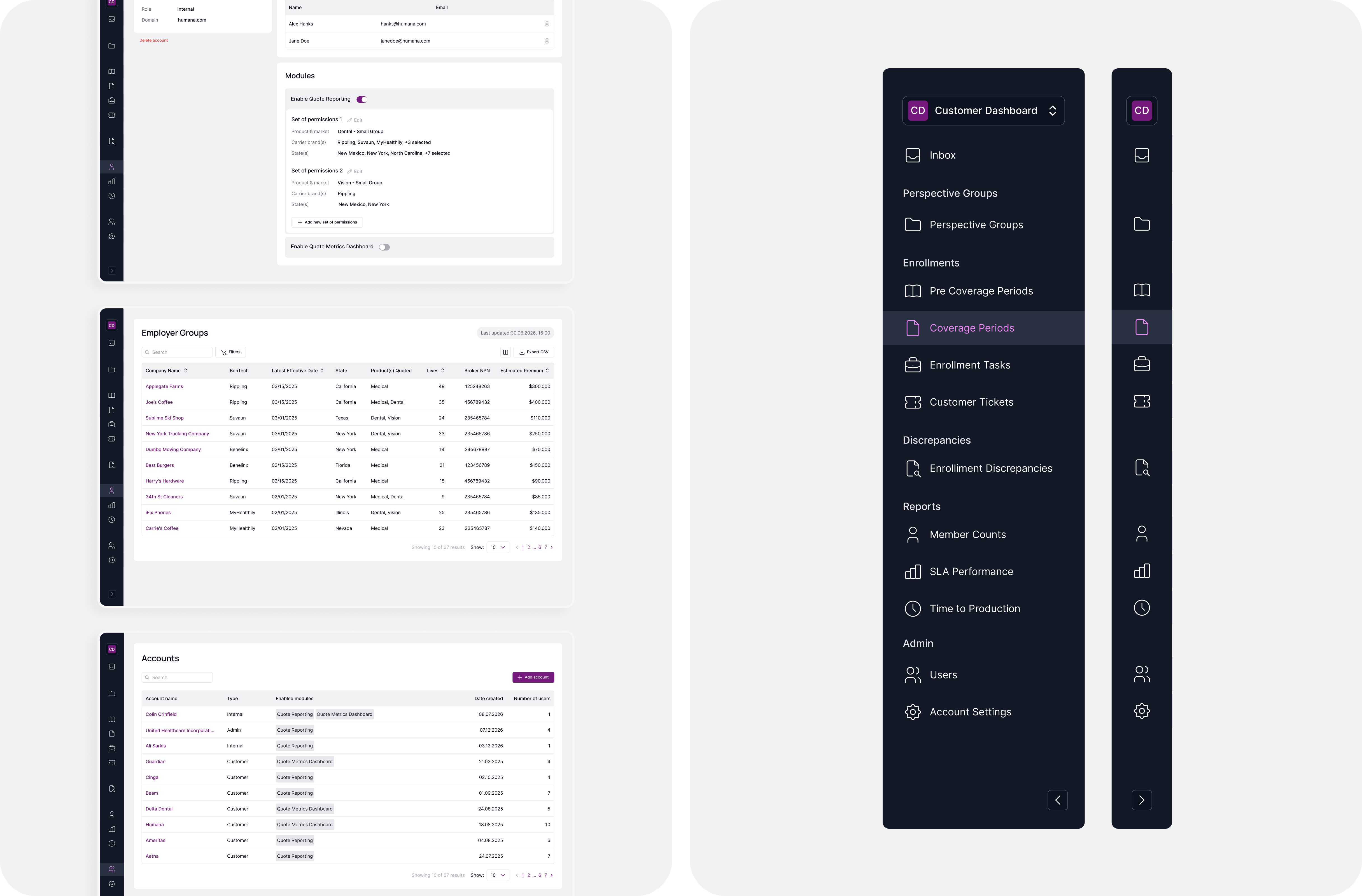
Working closely with the product team, we challenged the original assumptions and proposed a new experience built around the broker's real workflow — from a high-level nationwide view all the way down to county-level carrier data.
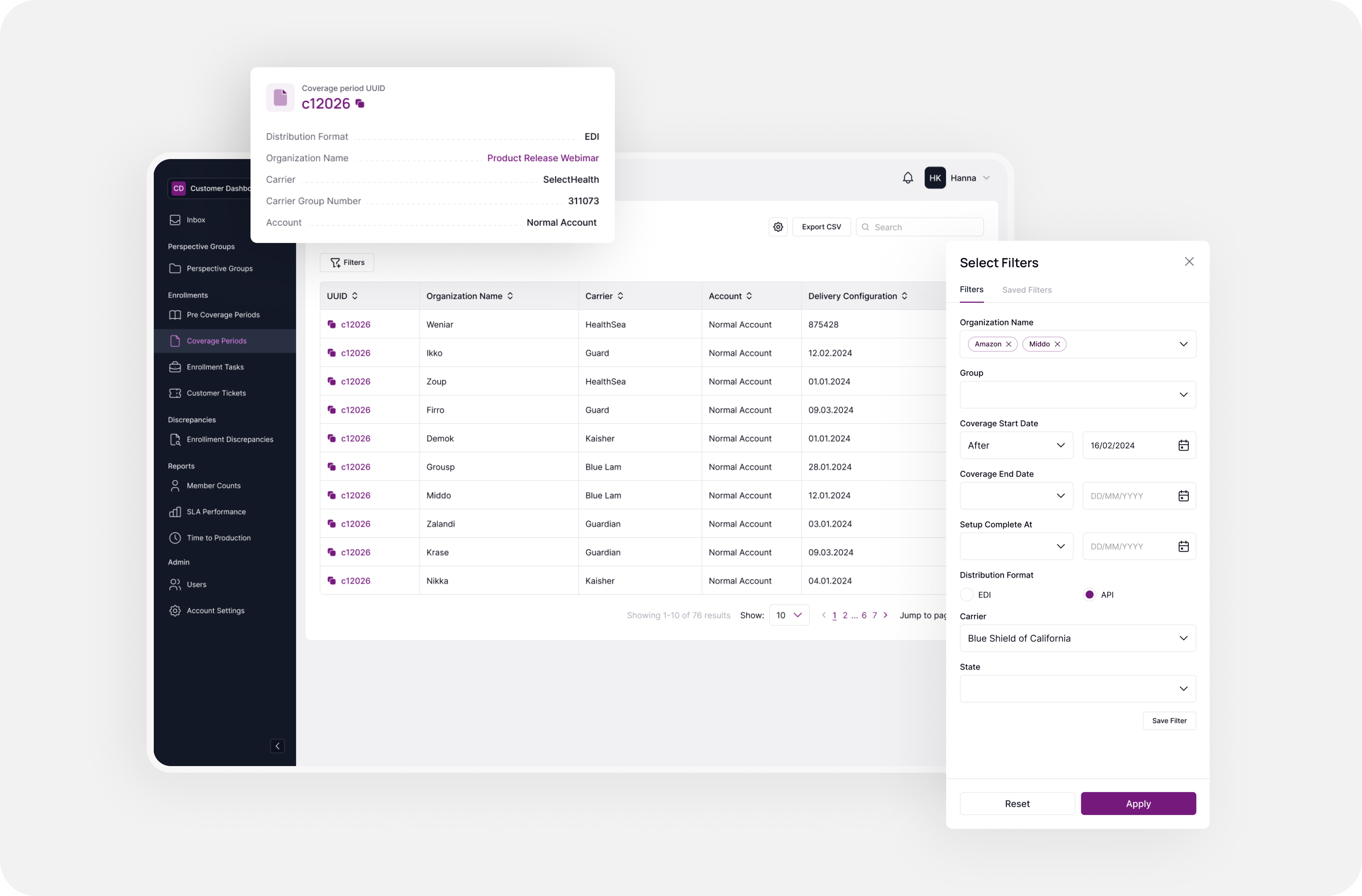
The process was iterative and collaborative throughout. Prototypes went back to stakeholders for real feedback, not just approval. That constant back-and-forth shaped every core decision: how the map behaves, how filters work, how carrier status surfaces at each level of detail.
Outcome
What started as a request to improve an existing dashboard turned into something bigger: a completely rethought user experience for a market that has never had a tool like this. We didn't just make the existing product better. We designed what the best version of this product could be.